Cyclica Inc: Ligand Express
Medium:
Audience:
Format:
Client:
My Role:
A user-friendly, cloud-based web application that gives scientists the ability to explore the biological effects of small molecules.
Adobe XD, Illustrator, Photoshop, After Effects
Pharmaceutical industry, academia
Web application, brand & promotional design
Cyclica Inc.
Web Designer, UX/UI Designer, Graphic Designer
Visit www.ligandexpress.com
overview
Cyclica Inc. is a biotechnology company specializing in using artificial intelligence and computational biophysics to accelerate the drug discovery process. A platform called "Ligand Express" was created to provide the pharmaceutical industry and academia insights in designing, screening and personalizing medicines for patients with greater accuracy.
the problem
The beginning stages of Ligand Express was designed and created. However, the platform lacked a design and user flow of an user onboarding process involving signing up, logging in and out, submitting ligands and collaboration opportunities such as managing projects and teams.
the process
As the web designer for this project, I worked alongside with scientists, developers, another designer and CEO to create an efficient and intuitive user onboarding process and for registered users to keep track of their drug submissions, projects and teams.
During the initial phase, there were several whiteboard and post-it note sessions to brainstorm out the scope, review users' needs/wants, consulting/interviewing with our clients and creating user personas , and solidify the deliverables. Below are some examples.


After finalizing features and user workflow, the lead developer and I brainstormed out user scenarios so that design tasks (wireframes, storyboards/GUI design) were more manageable. Each user scenario had its own wireframe. Wireframes were reviewed with another designer and lead developer to make sure implementation of features were feasible or not. After reviewing the first few wireframes, the GUI design was created by exploring ideas for colour palette and style guide. Cyclica had two official primary colours of blue and green but no secondary colours and font style. As for the aesthetic look and feel, they wanted to keep it professional looking with a modern, clean and friendly feel. To get the creativity ideas flowing, I looked at design and layouts of similar applications, compared good and bad aspects about them, and reviewed areas of improvement. Examples of wireframes, GUI design and style guide shown below:


Once the GUI design for each scenario were created, design documentations were handed off to the developers.
Final Product & Lessons Learned
After a successful initial launch of Ligand Express, the response from Cyclica's customers were overwhelmingly positive and some improvements were made after testing it out with some of their customers. Below are some screenshot examples of the final interface.

.png)


Although, it received a positive response, there are lessons to learn from this experience. When designing out an application that will be used across a variety of platforms and/or media, the style guide was established near the initial stages of the design process while wireframes were being made. This helped maintain consistency across the whole system and documentation.
Having a style guide also helped us address accessibility design which was something that I was particularly interested in tackling and wanted to be mindful of as a designer. I followed some of the guidelines found in the Google Material Design and World Wide Web (W3) Consortium, and used colour contrast checker tools like Colorable and Color Tool by Google Material Design. Although I was not able to fully research on the topic as it was not a major priority but rather something to be mindful of as a designer, I learned some of the basic elements and this area of study is definitely something I would like to explore more.
Others lessons learned from this experience was finding the best approach to handoff the design documentation to the developers. I typically ask what the developer's preference is but because we had different modes of communication (email, Slack, Gitlab) so at the beginning it was hard to determine which method was best. I ended up annotating my wireframes and GUI design using Adobe Acrobat Reader and uploading the documentation using the ticketing system on Gitlab which worked well for the team. There are however, other methods using prototyping tools like InVision and Sketch that have plugins for developers to instantaneously see the design specifications, which is something worth exploring more.
Lastly, even though we tested out the design and user experience with a couple of clients, having some more feedback would have been insightful and valuable at that time.
other
Some other design work that I worked on were updating and improving some of the features on Ligand Express such as colour palette, sorting and filtering feature, manipulating network graphs, and walkthrough tour guide video. Below are some examples:


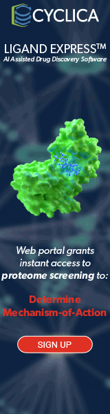
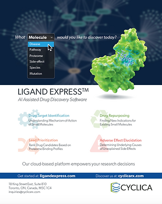
I also had the opportunity to work on brand design and marketing materials such as conference poster, digital and print magazine ads, and figures for Cyclica blog. Below are some examples: